Dan “Illarterate” Farrimond is indisputably the great master of the teletext visual art medium of our era – if not of all time. Not a silent titan of an extinct art celebrating privately in obscurity, he champions it as its technological irrelevance deepens (something we fans of ANSI art can appreciate), curating historical highlights and acting as a critical outreach locus for others interested in being involved with the further possibilities of this curious (apparently) dead end.
He gifted us with a metric ton of wholly meritorious submissions for MIST1015 and has since been waiting VERY patiently for me to interview him for a blog post. So… it’s about time!
So: teletext. It was never really A Thing here in North America, so can you set the stage a little for our readers the context for this, the most widely-penetrating of all textmode art forms? What is it, how do you access it, and why is it so great?
Teletext is the dark, silent, secretive ninja of the communication world. It is broadcast along with a television signal as raw data that your (teletext compatible) TV decodes and displays in an aesthetically pleasing text mode format. This means that as long as the data is transmitted, your TV set can ‘download’ pages of information to its cache. These pages typically carry news, weather forecasts, simple games and even live subtitles.
But it all remains hidden until you tap that ‘teletext’ key on your remote. Even the teletext data itself is discreet, hidden away in a cropped area of your television signal!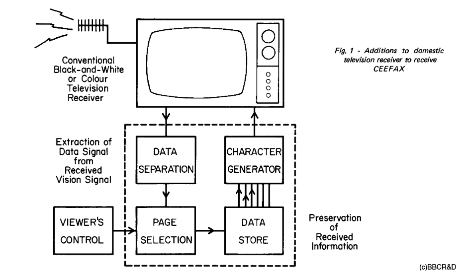
It is most amazing that this particular format, invented over 40 years ago, is still in widespread use as of 2016. However, as you mention, it is unfortunately creeping closer to extinction as a public communication system – The UK, Australia, New Zealand and most recently Singapore have already undergone that dreaded ‘digital switchover’, and others will surely follow.
But for the time being, teletext still runs in many areas of Europe including Germany, Austria, The Netherlands, Scandinavia and Spain. I trust it isn’t propaganda or an urban legend, but I read that Internet coverage isn’t as comprehensive as television broadcasts in some countries, so hopefully teletext has at least another ten years!
When did you begin making your own teletext art? Did you have any inroads to the avenues of broadcast teletext legitimacy or was this purely a fan celebration? Were you already a visual artist before you jumped in to teletext? If so, were any of your skills transferable or were there approaches you had to “unlearn”?
Teletext Cat from my first batch of teletext experiments in 2007.
Like most things, it began as experimentation. I was just some dude downloading a free teletext editor (Cebra Text, if anyone wants to look it up) and saying ‘look at me, Ma, I can make teletext pages!’
Once the novelty wore off, it took the International Teletext Art Festival for me to treat things seriously. I saw an open call on the Teletext Mailing List https://groups.yahoo.com/neo/groups/teletext/info (still in operation as of 2016) for the inaugural festival in 2012, which I contributed about a dozen experiments to. Well, I didn’t expect them to publish all of these, but there they were on teletext services across Europe!
Years before then, in the 1990s, I had letters ‘printed’ on a few different UK teletext services. I’m pretty sure I took pictures that I could post right now, but they were thrown out with the non-digital photographs in one of many house moves.
Now I think about it, that exhilaration of seeing something you made appear on television is what inspired me to become a designer, specifically a web designer/artist. Isn’t the Internet just a worldwide broadcast system, really? And the computer monitor – isn’t that just a fancy TV?
Picking up teletext design felt as though I was returning home, so to speak. I must have spent about seven or eight years as an artist looking for the right medium, even though I stared at it for at least 20 minutes a day, every day!
I believe a lot of basic design principles apply to teletext – never put green graphics on a magenta background, don’t fill the page with unwrapped text and so on. But actually, you can get away with most design decisions under the guise of ‘art’, even if it’s considered bad form by mainstream manuals of style.
It’s all down to personal taste. Many point to the ‘spidery’, blocky graphical style and cite it as old-fashioned, but I wouldn’t ever dream of censoring that, because teletext should never try to change what it is. Yeah, it’s a relic of the 70s, but that’s what makes it so great.
To quote my good friend and fellow teletext designer Carl ‘Carlos’ Attrill, teletext is the great leveller. Everyone, be they a beginner or accomplished artist, can learn the medium within an hour and create something equally as amazing.
But the biggest unlearning exercise has to be flipping your pen and ink sensibilities and acclimatising to the black background!
Is there any overlap between the royalty of historical teletext scriveners and the textmode / pixelart inheritors of their legacy today? (ie Did any of them continue doing related work for the love of it or was it just a gig to be abandoned once there was no longer a paycheck in it?)
It’s a sad thing to say, but I would assume most designers from teletext’s heyday did indeed move on to more current mediums and almost completely abandon their pixel art craft. It would, however, be interesting to see if those classic artists would consider revisiting the medium in light of its recent ‘artisan revival’ – there’s a book or two in that, certainly.
In a way, teletext was a very anonymous medium. Although their names were occasionally attached to cartoon strips or digitised doodles, artists were never celebrated in the way they perhaps should have been.
And writers would get little to no credit for their uncanny ability to space each headline evenly across 35 characters on an index page:
I’d assume those talented writers are working for news companies now. But the artists? Well, that bears further research.
I know for a fact that at least one of those artists/writers has relaunched his popular teletext column for the Internet age. Paul ‘Biffo’ Rose’s video game magazine ‘Digitiser’ was likely the most read of all features found on UK teletext, and that’s some achievement considering how many teletext services there were at that point.
Unfortunately, the iconic aesthetic is gone, but only because the people demanded it. Biffo’s old teletext characters and cartoons initially made a re-appearance on the all new Digitiser2000.com, but the public didn’t respond to them in quite the same way.
Back then, they were quirky and mould-breaking in a world of teletext restriction. But now, they are just ageing voices among millions of amateurs aping that style, perhaps without even realising they are doing so.
That sort of teletext was ephemeral. News is out of date before it’s even written about, never mind published in white (or cyan) on black.
But art lives forever.
How do you make your own teletext works? (design approaches and specific software)
My teletext editor of choice is Flair, still part of a commercial software package at time of writing. But as a free alternative, Cebra Text is excellent… if you can get it running on post-Windows XP systems, that is!
Whichever editor I use, the process is much the same. I have a Photoshop template with the dimensions of a graphic mode teletext page, and this is where the bulk of the design work is done.
But at this stage, the (admittedly fairly small) programming element of teletext design enters the process. You must take into account ‘control characters’, which indicate where in a row the graphic mode switches to text mode, or where colour change occurs. There are control characters for backgrounds, double height text and the pointilistic separated graphics mode, among others (see later in this article).
Each control character takes up a single 3*2 ’pixel’ block of graphics (as shown in the above image), which by default must remain blank (black). But there are a couple of ways to cleverly circumvent this if you know how. The easiest is to hide the codes inside thick black outlines, a technique used to great effect by Steve Horsley at Teletext Ltd. in the 1990s: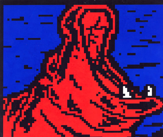
Next I import the graphic to my teletext editor and add those control characters. If it doesn’t quite fit, I go back to the Photoshop template and tweak things until it looks right.
…Or just redo the whole thing. I’ve lost count of how many pages I’ve abandoned partway through thinking ‘I’m never going to be able to fix this’. It’s a skill to know exactly when to say that!
As a kindred format of textmode artwork, teletext shares much in common with ANSI art – but is also very, very different in many important regards. Could you briefly tabulate its constraints (eg. single screens) and unique features (eg. that delicious reveal functionality) ? Given what you have seen of other textmode formats (ANSI, PETSCII, etc.), which of their extended capabilities would you bolt on to teletext, had you the authority to design the Teletext 2.0 spec? (Or would you eschew them all, feeling that it is precisely in its minimalist constraints where its appeal lies?)
A teletext page is a grid of 40w*24h spaces, each of which holding one character. Graphic mode characters are further separated into smaller 2w*3h grids, making for an overall canvas of 80w*72h ‘pixels’ per page.
If you don’t have enough room, you might have to spill over onto a subpage. The potential number of these subpages is quite large – I have personally witnessed carousels of over 100 on UK television! Bear in mind you can only view one page at a time, and have to wait at least 6 (but usually 8-12) seconds for your television to automatically move on to the next subpage. To sit and read all of those would take… a very long time indeed.
As for those unique features, the Teletext Broadcast Specification calls them ‘attributes’, so I guess that’s what they’re officially known as! Let’s briefly take a look at them…
* FLASH – Make foreground text or graphics blink constantly. Usually used in conjunction with the text LOWEST EVER PRICE or LIMITED TIME OFFER.
* BOX – Used for subtitles and in-vision news. The background is totally removed save for a black boxed area, allowing you to watch the TV broadcast while a teletext news ticker constantly updates, for example.
* DOUBLE HEIGHT – Placed text or graphics stretch to an extra row, effectively becoming twice as tall. Makes text easier to read from the other side of the room.
* HOLD GRAPHICS – The trickiest but most rewarding of teletext’s design functions. Allows you to ‘fill’ those blank control character spaces, but takes some practice.
* REVEAL – Elements of a page only appear when you hit the ‘reveal’ button on your remote. Useful for hiding secret messages to your mistress. Allegedly.
* SEPARATED GRAPHICS – Teletext’s iconic alternative graphic mode, as exhibited here:
On the whole I wouldn’t change anything about teletext. It is its own distinct medium, standing tall as a proud survivor of four whole decades of technological innovation, a bastion of simplicity and user friendliness. Adding function also adds complication, which never suited teletext.
I view PETSCII as an evolved form of teletext that never made it to the television screen, only monitors. Though it would be great to have those wonderful drawing icons of the 80s home computer character sets, teletext was ultimately a method of transmitting the written word.
Thus, making art feels like you’re doing something you were never supposed to! That’s the appeal, I think – teletext art is a relatively unexplored, and unfortunately undocumented, medium.
How did you manage to find an audience for your work after teletext went off the air? Is there a community of teletext creators?
Teletext art as a movement is a relatively new thing, so there hasn’t ever been a ready-made community for it. Earlier teletext fan webpages were populated by a wide spectrum of avid readers and tech enthusiasts, but few of them would have dabbled with teletext design on their BBC Micros back in the 80s and 90s.
Thankfully, the Internet loves specialism. Commemorative fork handles from the 1940s? There’s a website for that. Unusual methods of banana peeling? There’s a website for that… probably.
People are still very curious about how to create art from teletext – it’s something many of them never once thought about. But give them a teletext worksheet and some felt pens and it all begins to make sense!

If the digital switchover has given us anything, it has put teletext is back in the hands of the general public. Eschewed by commercial broadcasters (at least in the UK), the technology is now available for everyone to try. Some clever individuals have even made their own teletext editors: http://teletextart.co.uk/make-teletext-art
The people, I feel, are the future of teletext. They can keep it alive through the Internet and their own private teletext services.
We’re very close to creating something that will allow people to make and save teletext pages to a central database, the world’s first crowdsourced teletext superservice… or even series of services. It shall be the Internet of teletext, the teletext of the Internet!


